One of the 8 best works (7th place) on branding of a financial organization or bank for 2023 according to designrush.com. The jury noted respect for the traditions and historical symbols of Quebec, work with color and technology.
The Banque Du Québec is one of our most significant projects. We love working for socially significant enterprises. We are happy to help charitable organizations. But the Banque Du Québec is a truly historic project.
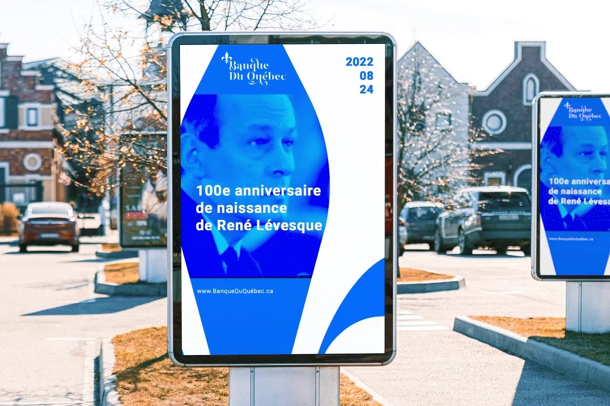
For this customer, not just branding, but a symbol of a new page in the history of Quebec. A lot of people expect to find the Banque Du Québec and style it for it – it was a very important and big challenge for us. The style was based on elements that have become absolutely recognizable – Fleur De Lis, and cornflower blue – the same ones that adorn the flag of Quebec.
However, when developing a style, it was necessary not so much to focus on the past. but to perceive the future. Combinina a recognizable svmbol with a performance, and rendering it in a 3D illustration, we’ve been dragging out a vibrant and recognizable style that works great in both digital and real-world environments. The exclusive use of the herd key illustration with the blue Lily, which has become the New Symbol of the Bank of Quebec.
Symbol & Logotype
The Brand logo is the main element of the corporate identity of the company. The logo must be present on all media of the company. The Primary Inscription is preferred, but an abbreviated inscription or symbol may be used if necessary.
Primary inscription
Abbreviated inscription
Symbol
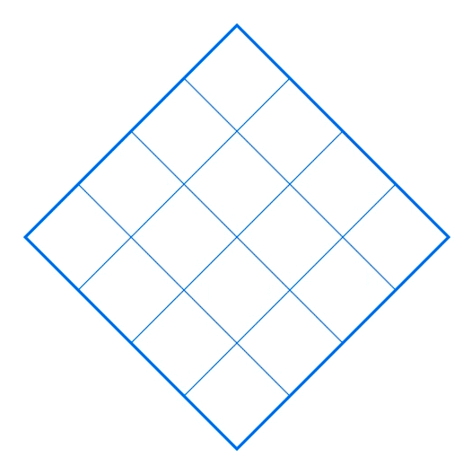
The Brand symbol is the main element of the brand identity. This symbol represents all activities of the company and is used on all media. The symbol underlies the company logo. It can also be used as a standalone element. All symbol proportions are fixed and cannot be changed. The symbol must only be used from original materials.
The color palette of the Brand consists of several colors: “Quebec Cornflower”, white, gray, black and “River Sand”. For important headings, decorative elements and individual inscriptions, an Magnies Regular font is used. It cannot be used in body text, in a small size, or otherwise than in a regular style.
Today, creative solutions developed by Brandstage are used by many companies around the world. We created the Bank of Quebec brand in Canada, a children's art studio in New York, a car dealer in Luxenburg, developed a concept and advertising for a water manufacturer in Dubai, a logo and style for an interface design studio in Germany, a style and concept for a casino in Singapore, Greek restaurant in Amsterdam. Today our portfolio includes more than 20 international projects, and we are ready to expand geographically.
Would you like to share your project with us?
Connect
How do we work?
01
Total focus
When we start a project, we are completely immersed in its environment and market. We will not offer you a creative solution until we ourselves believe in it, as we believe there can be only one Sun. As you understand, there can’t be two Suns in the sky – that’s why we offer only one option, and we don’t accept changes to the concept (except for details, such as shade or font replacement).
02
360
We can take on a small task in your marketing – social media banners or outdoor creatives. But we are especially effective in developing 360 advertising campaigns and branding. We include all the necessary expertise and guarantee the recognition and quality of advertising in all channels.
03
Art & experiments
For us, each of our cases is a work of art. We apply the latest visual technologies and the latest marketing practices. We love experiments and non-trivial solutions.